






Celium
Designing a GPU marketplace around comparing hardware, rental cost and running jobs.
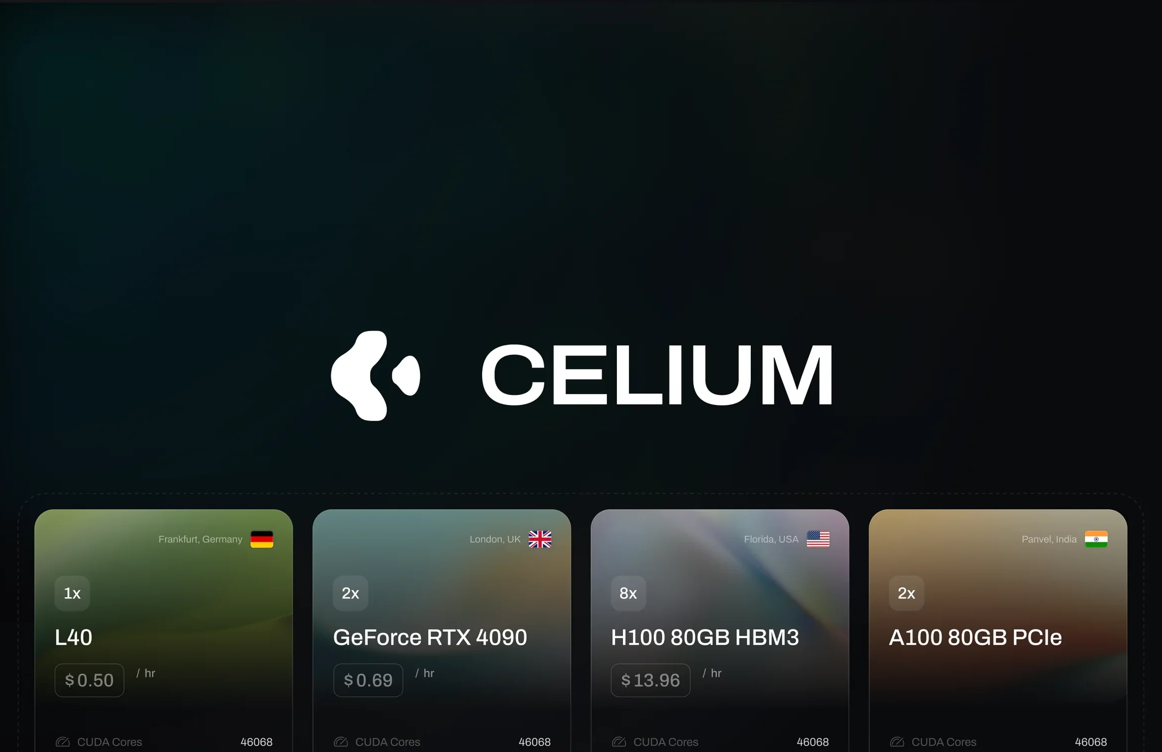
The problem
A developer renting a GPU is making one decision. Which card, in which region, at what price per hour. Everything else on the screen can get in the way of that. Specs come in long sheets that are hard to put side by side, and the real hourly cost is often something you work out yourself. Then SSH keys and billing can each sit on their own page, so getting from choosing a machine to running a job means a lot of jumping around.
What I decided
I designed the marketplace end to end, from the landing page to the running job. The main idea was that a machine should read the same wherever it shows up. Count, model and price per hour lead on a browse card, on the map, in checkout and on a running pod, with the full spec sheet underneath. Renting sits one step from browsing, and the machine you picked stays on screen while you set up the job, so you always know what you are paying for.
The surfaces
The screens where you browse, rent, run and pay for a GPU, with the decision behind each one.
Specs lined up to compare
Each card leads with GPU count, model and price per hour, and the full spec sheet sits underneath. One filter rail on the right narrows the set by price, VRAM, CPU, RAM, storage, bandwidth and model.
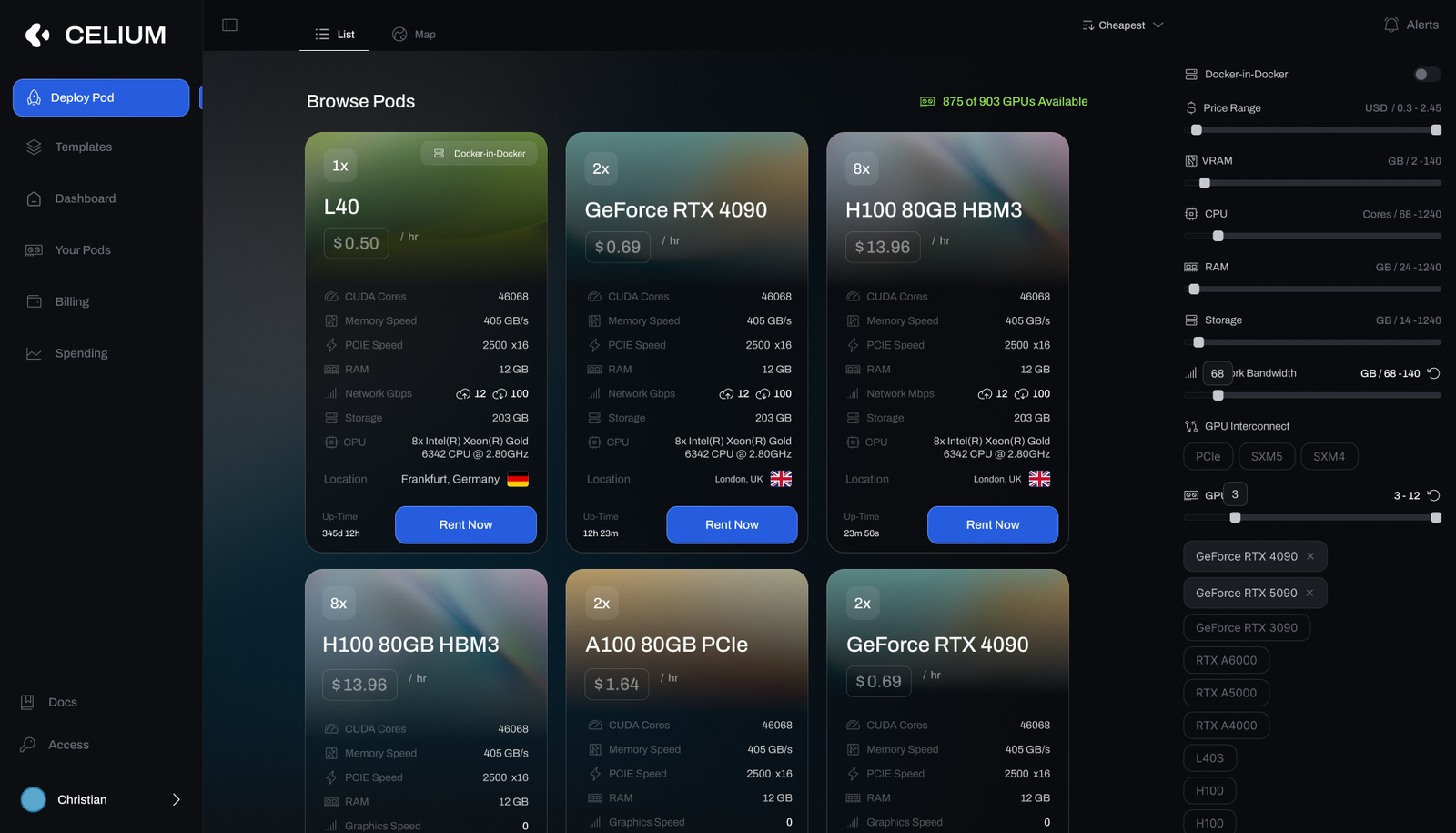
- The three things that decide a rental come first, the rest sits underneath.
- Rent Now is on the card, so you can commit from the place you compared.
Pick by region on a map
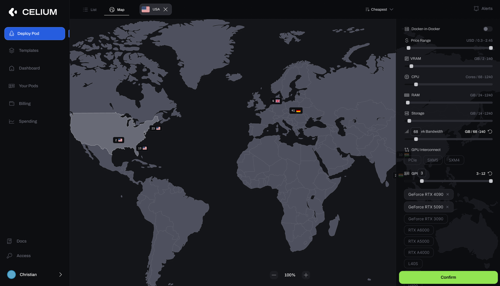
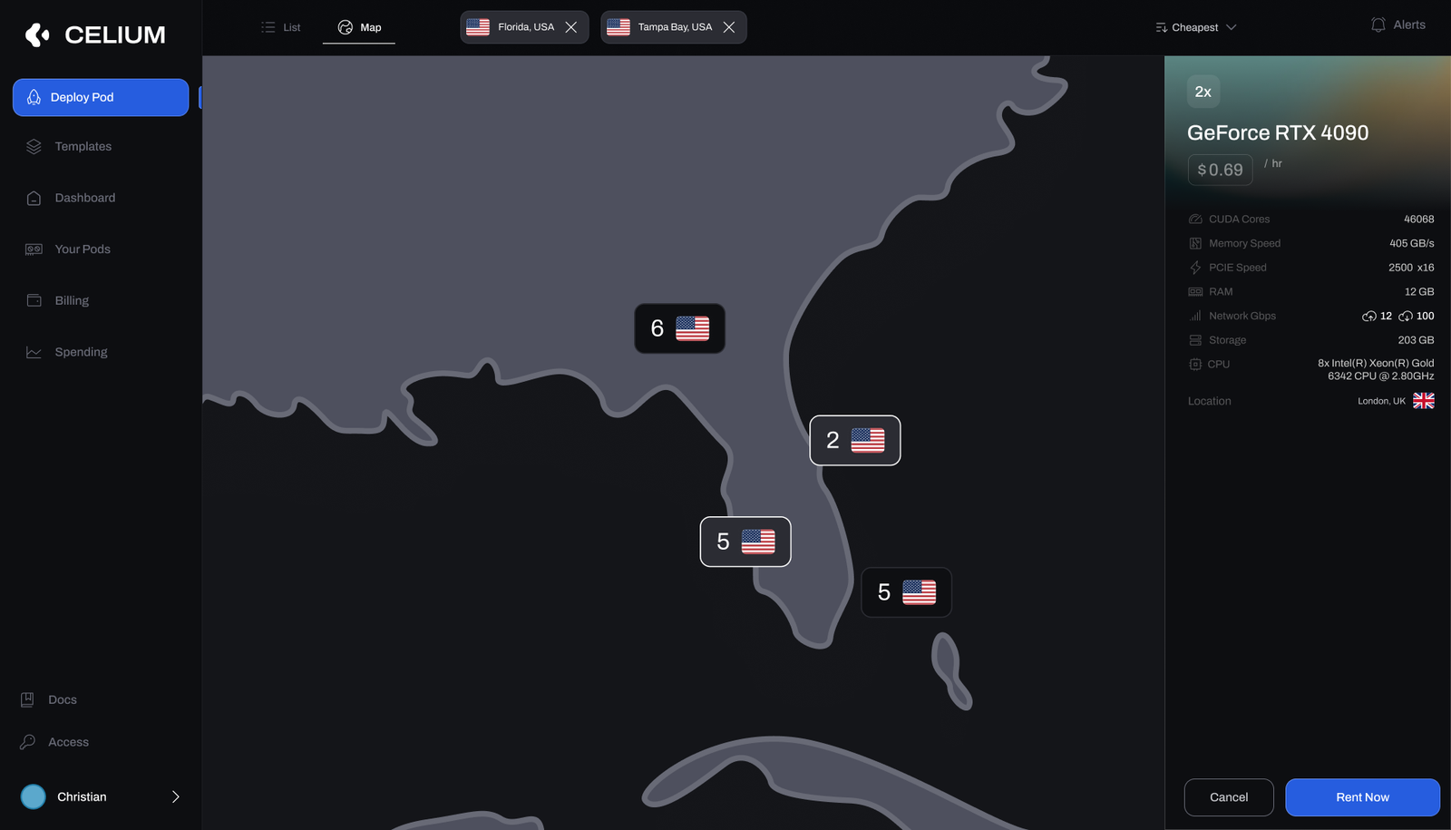
Some teams choose by location first, for latency or data residency. The map shows how many GPUs each country has, and you can zoom in until a single node is in reach. Selecting one opens the same spec sheet as the grid, with the price and Rent Now in the panel.
- The node panel uses the same layout as the browse card, so there is nothing new to read.
From a node to a running pod on one screen
Renting is one vertical flow. You name the pod, keep or change the template, add SSH keys and switch on options like an encrypted volume, terminal access or a Jupyter notebook. The node you picked stays pinned on the right, and the GPU and disk costs add up to a total per hour before you press Rent Now.
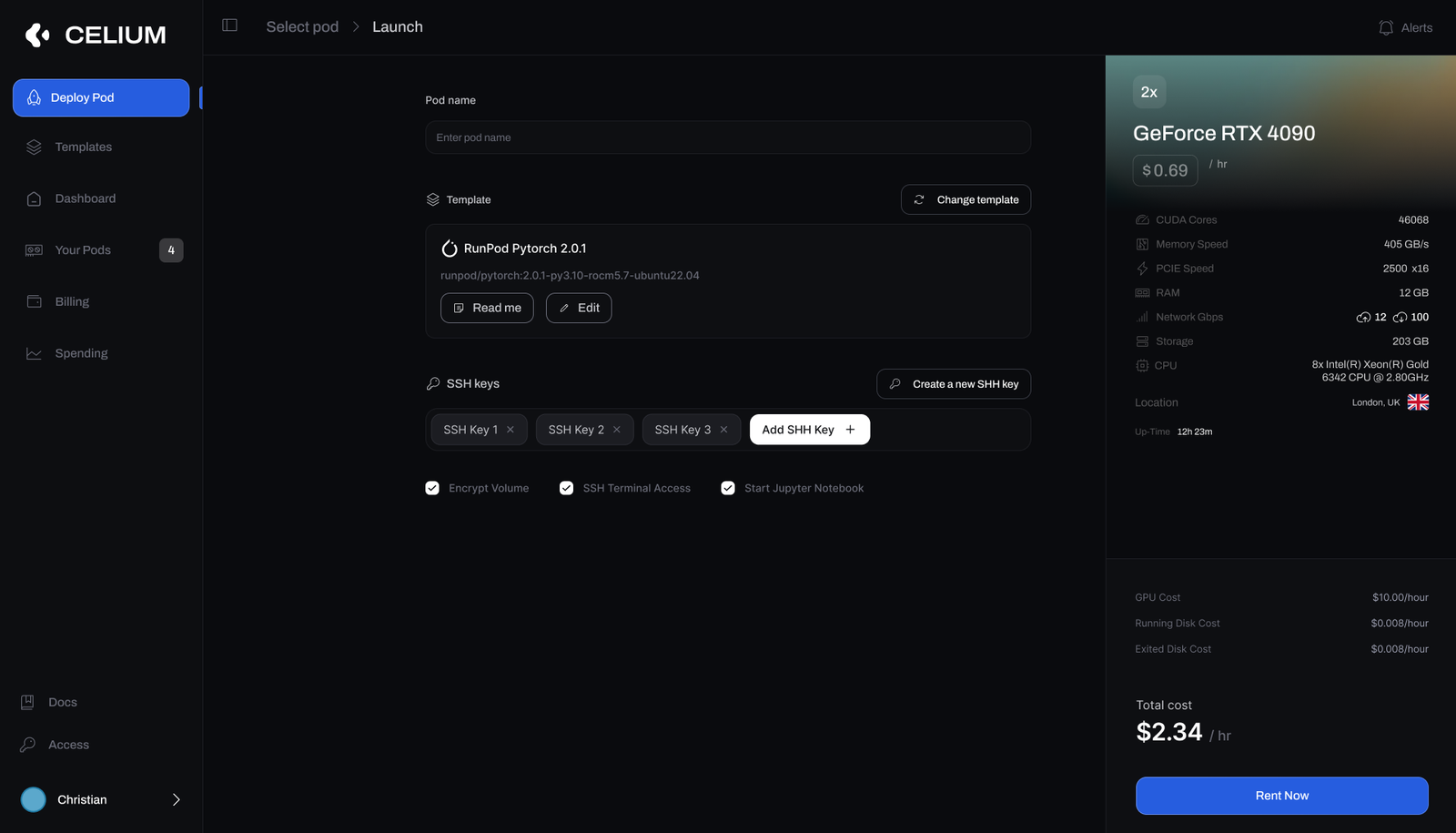
- Template, SSH keys and runtime options sit together on this screen.
- Seeing the total per hour before committing was the point of this screen.
Reading a running pod
Once a pod is live, the same product becomes its monitor. The top strip shows spend, uptime and network throughput with the status and the Connect, Reboot, Stop and Delete controls. Below it, per-GPU utilization, temperature, memory and power sit next to CPU, RAM, storage and CUDA load, with the SSH connection string and ports on the same page.
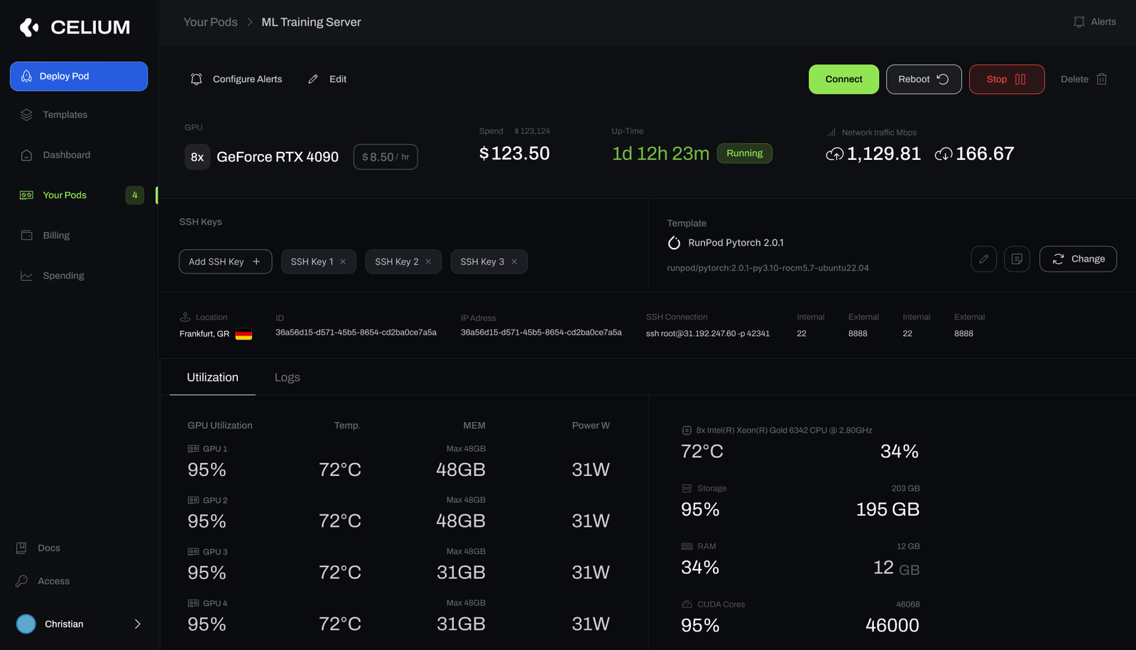
- The controls sit where the operator is already looking, so stepping in does not need another page.
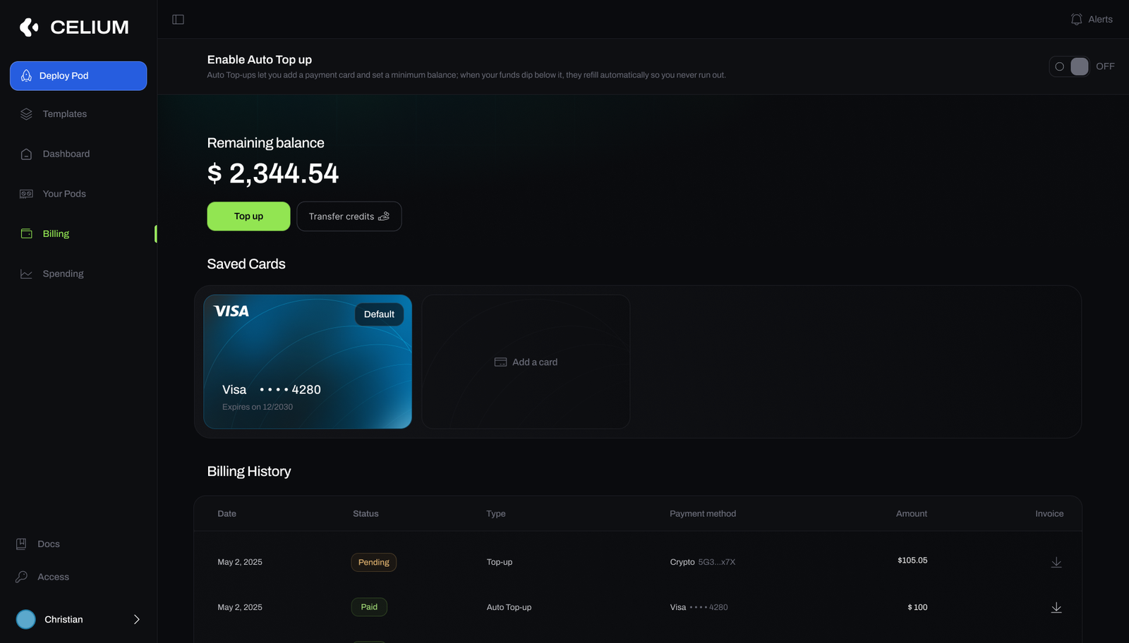

What you have and where it went
Billing works as a balance you fund. The remaining balance leads, with top up and credit transfer next to it, and every charge is listed with its invoice. Auto top-up refills the balance when it falls below a minimum you set. The spend view shows total and hourly cost over the billing window and breaks it down per pod, with a CSV export.
- Cost is broken down per pod, so a team can see which job it paid for.
The landing page
The marketing site I designed for Celium. It is the front door into the marketplace.
What shipped
In the end a simpler listing interface shipped than the marketplace shown here. That is one reason I now prototype the interactions and stay involved through implementation.