





Dashboards that work, part 2 of 2
How to get Claude to design a good dashboard
Tell it the answer and the reader. A prompt you can copy, a skill, and a five second test.
 Savva Sicevs
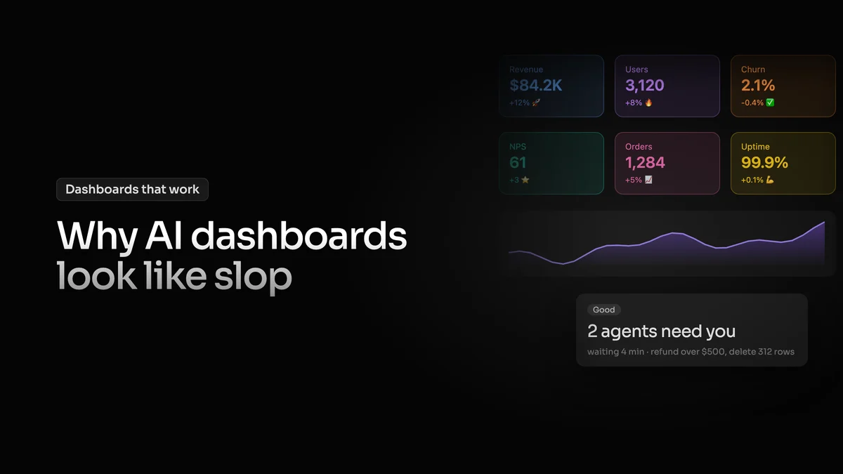
In part 1 I went through the tells that make an AI dashboard look like slop: no answer at the top, everything equally loud, a screen that's never calm and a 0 that lies. They all come from one thing. Claude, v0 or Lovable doesn't know what the screen is for or who will read it, so it guesses. You have to tell it two things, the answer and the reader.
This works with any model, and for web apps as much as dashboards.
Tell it the answer
Start with one sentence: who opens the screen, what they want to know and what they do next. For example, a shop owner opens this to see how much they sold today and whether any orders need shipping, and then ships them. That sentence decides what goes at the top, and the AI can't guess it for you.
Tell it who's reading
Give the same dashboard to an analyst who has lived in it for years and to a founder who opens it once a week, and one of them will get it in a second while the other one stares at it. The screen can be exactly right for the first person and still be wrong for the second, and a lot of the arguments about whether a dashboard is good are really about who it was made for.
So before anything else it's worth asking how much the people using it know about the thing they are looking at. The less they know, the simpler the screen and the numbers have to be, so they don't have to think and guess. An expert already knows where to look, they read several numbers as one pattern and they want everything in front of them. Someone with less knowledge needs the screen to tell them where to look first.
This has been measured too. In a 1986 NASA study, researchers redesigned dense Space Shuttle displays into cleaner, grouped ones. People without expertise got much faster and more accurate. Experts made fewer errors but weren't any faster, because they already knew where to look. Stephen Few, who wrote the book Information Dashboard Design, put it simply: where the lines are drawn depends entirely on the audience.
You can see it in tools used by both kinds of people. Google Analytics has standard reports for everyone and Explorations, which Google describes as advanced techniques that go beyond the standard reports. Nielsen Norman Group's seventh usability heuristic, flexibility and efficiency of use, says the same in design terms: shortcuts the novice never sees speed up the expert, so one product can serve both.
The same shop for two readers. Someone new gets one answer and what to do next. An expert gets everything at once, with quieter accents.
The answer gets the accent
For people who know less, the answer has to be impossible to miss. You make it big, you put it where the eye lands first and you give it the colour, you don't hide it in a small tag or in the 6th column of a table. In a shop dashboard that usually means today's sales is the biggest thing on the page, the change under it carries the colour, and the chart under that is there so you trust the number.
The metrics that matter less still belong there, they can explain the answer or change it, they just get less weight, smaller type and grey where the answer gets colour. That's the christmas tree from part 1. NN/g's guide to visual hierarchy says to use bright colours for the important items and warns that when too many colours of similar strength are used, people lose the sense of what matters most.
Experts can take more
For an expert screen you can turn this down. The accent can be quieter and the density higher, because they know what they are looking for and they want it all in view. One plain table with every number in it is fine for the person who built it and uses it every day. The same table is hard for anyone else, and even for its own author after a week away, when they come back hunting for the row they used to know by heart.
A common fix for AI dashboards is more density, tighter spacing and more on the screen. That's right for an expert screen and wrong for a newcomer, so it depends on who you told the AI is reading.
Either way a dashboard is a set of clues for where to look. A big number or a big chart is a clue for your eyes, and colour is one of the strongest ones, which is why you can only spend it on a couple of things. How many clues you leave depends on how much the person already knows, a newcomer needs the path laid out and an expert needs it to stay out of the way.
The prompt
Paste this before you ask for the screen and fill in the brackets.
Or put it in a skill
A Claude skill is a set of instructions that Claude uses automatically when relevant, so you don't paste the prompt every time. Most of the UI design skills I've seen are about landing pages. For dashboards you can write your own from the prompt above, or use mine: the Style kit is my dashboard and page rules packed into a Claude plugin.
Check it in five seconds
A simple test is the five second test. Show the screen to someone close to the real user for 5 seconds and ask what they saw. If they say the answer, it works. If they name the loudest thing on the screen and that thing isn't the answer, the accent is in the wrong place. And if the right answer only comes from someone who already knows the product, the screen is built for experts, which is fine as long as experts are who will use it.
Try it: five seconds on the AI version, then on the good one. If you name the loudest thing and it isn't the answer, the accent is in the wrong place.
There is always more data than a screen can hold, so the work is knowing who is reading it, deciding what their answer is and letting everything else make room for it.