





Dashboards that work, part 1 of 2
Why AI dashboards look like slop
Four structural tells, each with a live example you can click and a fix.
 Savva Sicevs
Ask Claude, v0 or Lovable for a dashboard and you get the same screen. A row of stat cards, one chart, a table and a sidebar. It looks clean, and people still call it slop the second they see it.
Most of the talk about AI slop is about the surface, the purple gradients, the same fonts, the emojis. Nielsen Norman Group, the best known UX research firm, tested AI prototyping tools in 2025 and found the same: without detailed specs they output a similar, generic look, with a lack of visual hierarchy and overused colours. Those are real, and on a dashboard there's a bigger tell. The screen doesn't answer anything. The AI doesn't know what question you open it with, so it shows everything at the same volume and leaves the answer to you.
I tested this with the design grader I'm building. It checks public design rules, things like contrast, text size, spacing and number formatting, and I ran it on 11 dashboards people built with AI and posted on X, and on 55 real products: the status pages of GitHub, Slack and OpenAI, analytics like Plausible and OpenRouter, and finance apps like Robinhood and Yahoo Finance. The AI built ones passed 70% of the rules on average. The status pages and analytics passed 66 to 69%, the finance apps 54%. By the rules, the AI dashboards are as good as the real ones or better, and I don't think anyone who has used both would agree. The rules check hygiene, and slop is about what the screen is for.
I say dashboard here, and most of this goes for web apps too. An admin panel, an AI tool, an analytics product, a banking app, they're all screens people open to find something out and then act on it. The line between a dashboard and an app is pretty blurry, so read dashboard as any screen like that.
Tell 1: there's no answer at the top
Everyone opens a dashboard with a question. How much do I have and did it go up today. Which of these alerts needs me right now. Is anything broken. Good dashboard design answers it before you've had time to go looking.
AI dashboards usually open with a row of totals. 12,480 runs today is just a number, and you're left to work out if that's good or bad. 2 agents need you tells you something. Stephen Few, a data visualisation consultant who wrote the book Information Dashboard Design, makes the same point about a sales total shown on its own: compared to what, is this good or bad?
An AI agent console. Same tell: totals at the top, and the two things that need a person are missing.
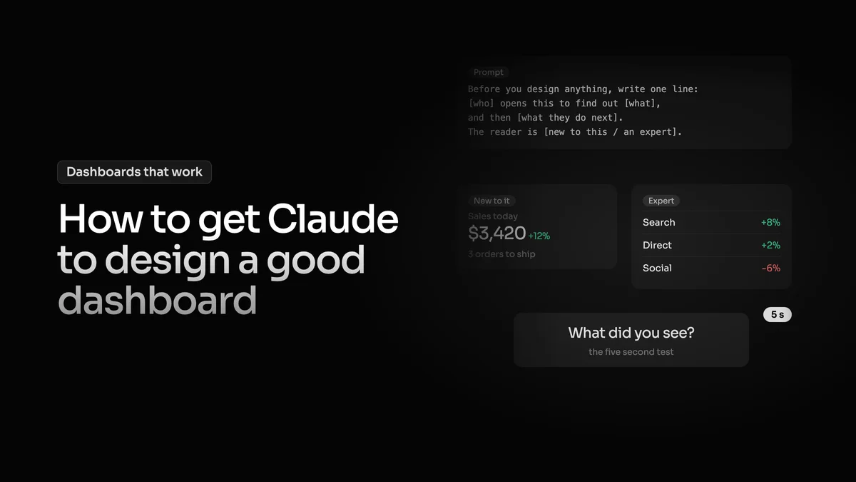
The fix starts before any design. Write one sentence: who opens this, what they want to know and what they'll do next. Once that sentence exists every element has a job. It's either the answer or it helps you believe the answer, and the rest can wait in a tooltip, a side panel or a second page.
Tell 2: everything is equally loud
AI gives every card the same size and the same weight, and often its own colour, which is what people mean when they say a dashboard looks like a christmas tree.
Real products get this wrong too. I looked at review queue products, the screens where a person approves or rejects something a system flagged. On the four best ones I found, the decision the screen exists for was the smallest thing on it, and the reason behind a flag was 9px grey text under a bold title. NN/g puts it in one line in their guide to visual hierarchy: if everything is contrasted, then nothing stands out.
Every card has its own colour, the christmas tree. On the right only the answer has colour.
The answer gets the size, the place where the eye lands first and the colour. Everything else gets quieter.
Good dashboard design reads at three speeds
I think of every dashboard as read at three speeds. A glance of about 5 seconds to see if anything is wrong. A scan of about 30 seconds to see what and where. And a few minutes of study to understand why and decide what to do. AI dashboards only serve the last one. Everything is there and complete, and it's no help when you only have 5 seconds.
NN/g defines a dashboard as a single page view of at a glance information that users can act on quickly. Ben Shneiderman, a computer scientist at the University of Maryland, put the same order into his well known mantra for data screens: overview first, zoom and filter, then details on demand.
One screen read three ways. The glance gets the answer, the scan gets where, the study gets why.
Tell 3: it's never calm
A status screen that always has something yellow on it teaches you to ignore yellow, in my experience within a week or so. NN/g saw the same thing in a 2026 study of smart home alerts: too many alerts cause notification fatigue, people start ignoring them and miss the one that matters. Their fix is that an alert should expire once the issue is resolved.
So when nothing needs you, the screen should look almost empty and say that out loud. The detail stays one click away. NN/g calls that progressive disclosure: show the few things that matter first and the rest when someone asks for it.
A calm screen still answers. It says it is fine, when it last looked, and where the detail is.
Tell 4: a 0 that lies
The worst thing a dashboard can do is give a wrong answer calmly. A day with $0 in revenue and a server that didn't answer look exactly the same if the screen shows 0 for both. The first of NN/g's 10 usability heuristics is visibility of system status: the design should always keep people informed about what is going on. A calm zero does the opposite. My own board once told me 30 of 68 pages were indexed when the truth was 64 of 67, because it was counting the wrong thing.
So show when data didn't load, and show how old it is. A feed that stopped 40 seconds ago still looks live unless the screen says so. Datawrapper, the chart tool newsrooms use, warns about the same thing: an empty cell and a zero mean different things.
The same failed request. Left shows a calm zero, right says what happened.
How to fix it
Every one of these tells comes from the same gap. The AI doesn't know what the screen is for or who is reading it, so it guesses. Part 2 is about telling it, with a prompt you can copy: How to get Claude to design a good dashboard.